
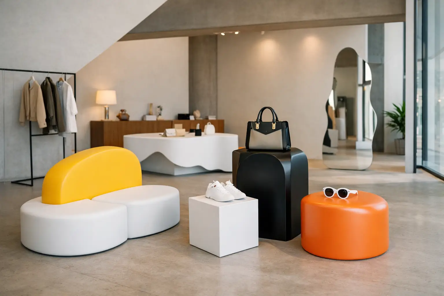
A pop-up has seconds to establish its point of view. Before a visitor reads a sign, scans a product, or speaks to staff, the furniture has already communicated whether the space feels premium, playful, experimental, or forgettable. The strongest retail pop up furniture examples do more than fill an empty footprint. They choreograph movement, create a setting for products, and give people a reason to stop, photograph, and stay.
For retail designers, temporary does not mean generic. A short lease can be the ideal setting for forms, colors, and spatial gestures that would be too risky for a permanent rollout. The challenge is to make that impact while respecting practical realities: installation windows, storage, accessibility, traffic flow, cleaning, and repeated use.
What Pop-Up Furniture Must Accomplish
A successful pop-up environment needs furniture to work harder than it would in a conventional store. It may need to act as seating, display, wayfinding, and brand scenery at the same time. Every piece should earn its footprint.
The right approach depends on the category and visitor behavior. A beauty launch may benefit from generous waiting zones and mirror-ready seating. A sneaker release needs a clear queue, a product focal point, and places where customers can try on or compare. A design-led food activation needs surfaces that withstand spills and forms that keep circulation moving. There is no universal furniture package, but there are recurring strategies that deliver results.
10 Retail Pop Up Furniture Examples to Specify
1. Sculptural central benches
A large bench at the center of the floor plan creates an immediate anchor. Instead of lining furniture against walls, a sculptural island gives visitors a reason to enter the space and move around it. It can also divide zones without building opaque partitions.
For a fashion or footwear pop-up, consider a low, rounded bench that supports fitting, waiting, and informal conversations. A single expressive form is often more effective than several ordinary stools because it creates a recognizable visual signature from every angle. Keep the height appropriate for the task: lower lounge seating encourages lingering, while a slightly higher perch suits quick try-ons.
2. Branded seating in a signature color
Color can carry a campaign before graphics do. A bank of seating in an unmistakable brand tone turns a neutral shell into a branded environment with relatively few elements. This is especially useful in malls, galleries, and event venues where architectural alteration is limited.
The trade-off is visual intensity. Saturated color is powerful when the product palette is restrained, but it can compete with highly patterned merchandise. In those cases, use the signature color on a single hero object, then balance it with quieter display elements and flooring.
3. Modular lounge landscapes
Modular poufs, low blocks, and curved lounge components allow a team to reshape the space as traffic changes. On opening night, the pieces can form a social seating field. During a product demonstration, they can become audience seating. Later, they can separate into smaller waiting moments near fitting rooms or checkout.
This flexibility matters when the final footprint is not fully known until installation. Modular furniture also travels well across a multi-city activation, provided each element is sized for handling, packing, and access routes. Specify connectors or a layout plan when stability is essential, especially in high-traffic public settings.
4. Product display plinths with soft geometry
A plinth does not need to be a hard-edged white box. Rounded, tilted, stepped, or organically shaped pedestals can frame a hero product while extending the campaign language into the three-dimensional space. For cosmetics, accessories, or limited-edition objects, the display itself becomes part of the visual story.
Soft geometry is particularly effective when a brand wants an approachable, tactile atmosphere. Yet display requirements remain non-negotiable. Establish the product’s ideal viewing height, weight, security needs, and lighting angle before finalizing the form. Drama should support the merchandise, not make it difficult to shop.
5. Flexible queue and consultation seating
Queues are often treated as operational clutter. In a well-designed pop-up, they can become part of the experience. Small stools, leaning perches, or compact benches give waiting customers a place to settle without blocking circulation. They also make a consultation zone feel more intentional than a row of temporary chairs.
For services such as fragrance discovery, skincare matching, or custom fitting, seating should position the guest comfortably while allowing staff easy access. Upholstered, coated forms offer a more inviting alternative to conventional contract seating, especially when the brand is selling emotion, ritual, or self-expression.
6. Window-facing conversation pieces
A pop-up located on a busy street or inside a department store needs an outward-facing gesture. Place one distinctive seating object or display form where passersby can see it from outside. The object should be legible from a distance and intriguing enough to prompt a closer look.
This is not simply decoration. A visible conversation piece can provide the photograph that circulates beyond the site. Avoid making it too precious to use. The most compelling retail moments invite participation, whether that means sitting, posing, testing, or interacting with the object.
7. Multi-level platforms for a product story
Stepped platforms create hierarchy without permanent millwork. They can present a product family at different elevations, form a small stage for launches, or introduce a landscape-like setting for mannequins and objects. In compact spaces, vertical variation makes a limited footprint feel more composed.
Pay close attention to edge conditions and accessibility. Platforms should be clearly defined, safely navigable, and not become trip hazards during peak traffic. If the top level is intended for staff or merchandise only, communicate that through placement and lighting rather than relying on signage alone.
8. Playful interactive seating
For youth-oriented launches, family-centered retail, or brands with a lighthearted identity, furniture can become an activity. Oversized forms, rocking volumes, soft obstacles, or unexpected silhouettes encourage visitors to touch and engage. That physical interaction often creates stronger recall than a conventional product wall.
The specification must be disciplined beneath the playfulness. Check stability, surface resilience, cleaning requirements, and whether the form supports the expected user load. A playful object that constantly needs resetting will frustrate store staff and dilute the experience.
9. Indoor-outdoor transitional furniture
Many pop-ups spill into courtyards, sidewalks, terraces, or festival grounds. Furniture that visually connects indoor and outdoor zones makes the activation feel larger and more coherent. Planters, benches, and lounge elements can establish a continuous palette while managing the shift from retail interior to public realm.
Outdoor use introduces real material questions. Consider ultraviolet exposure, drainage, heat retention, weather, anchoring, and nighttime security. A coated foam piece can offer a strong, monolithic appearance with a tactile surface, but the coating and intended environment should be matched carefully to the project’s conditions.
10. Custom mascot or campaign objects
The most memorable pop-ups sometimes need furniture that is not immediately recognizable as furniture. A brand character can become a seat. A logo-inspired curve can become a lounge. A product detail can be enlarged into an inhabitable display form. These pieces make the campaign spatial rather than merely graphic.
Custom work is most effective when it begins with use, not only appearance. Define who will sit on it, where it will live, how it ships, and whether it will be reused after the activation. Manufacturers with specialized fabrication expertise can translate an ambitious sketch into a production-ready object while resolving scale, structure, coating, and finish. Sixinch’s coated-foam approach is especially suited to this kind of expressive, continuous geometry.
How to Build a Cohesive Furniture Plan
Start by identifying the primary action: discovery, fitting, consultation, checkout, community, or content creation. Then assign furniture to support that action before adding decorative pieces. A central bench may support fitting and social proof. A curved display island may guide circulation. A photographic lounge object may extend the campaign’s reach online.
The plan should include moments of compression and release. Visitors need a clear entrance and a direct sightline to the hero experience, but they also need places to pause without interrupting others. Rounded forms often help soften traffic patterns, while long linear benches can establish order along a perimeter or queue.
Durability should be designed in from the first conversation. Ask how often surfaces will be cleaned, whether bags or shopping baskets will strike the furniture, how products will be secured, and whether the installation will travel. A piece that looks pristine in a rendering but cannot withstand a six-week activation is not a successful specification.
Design for a Second Life
The smartest pop-up furniture is not disposable. A custom bench can move to a flagship store, showroom, office lounge, or future event. Modular pieces can be reconfigured for different floor plans. Campaign objects can become content backdrops or permanent brand artifacts.
Treat the temporary retail setting as a stage for ideas that deserve to last. When furniture is designed with equal attention to impact, function, and fabrication, a pop-up becomes more than a short-term shop. It becomes a physical memory of the brand.