
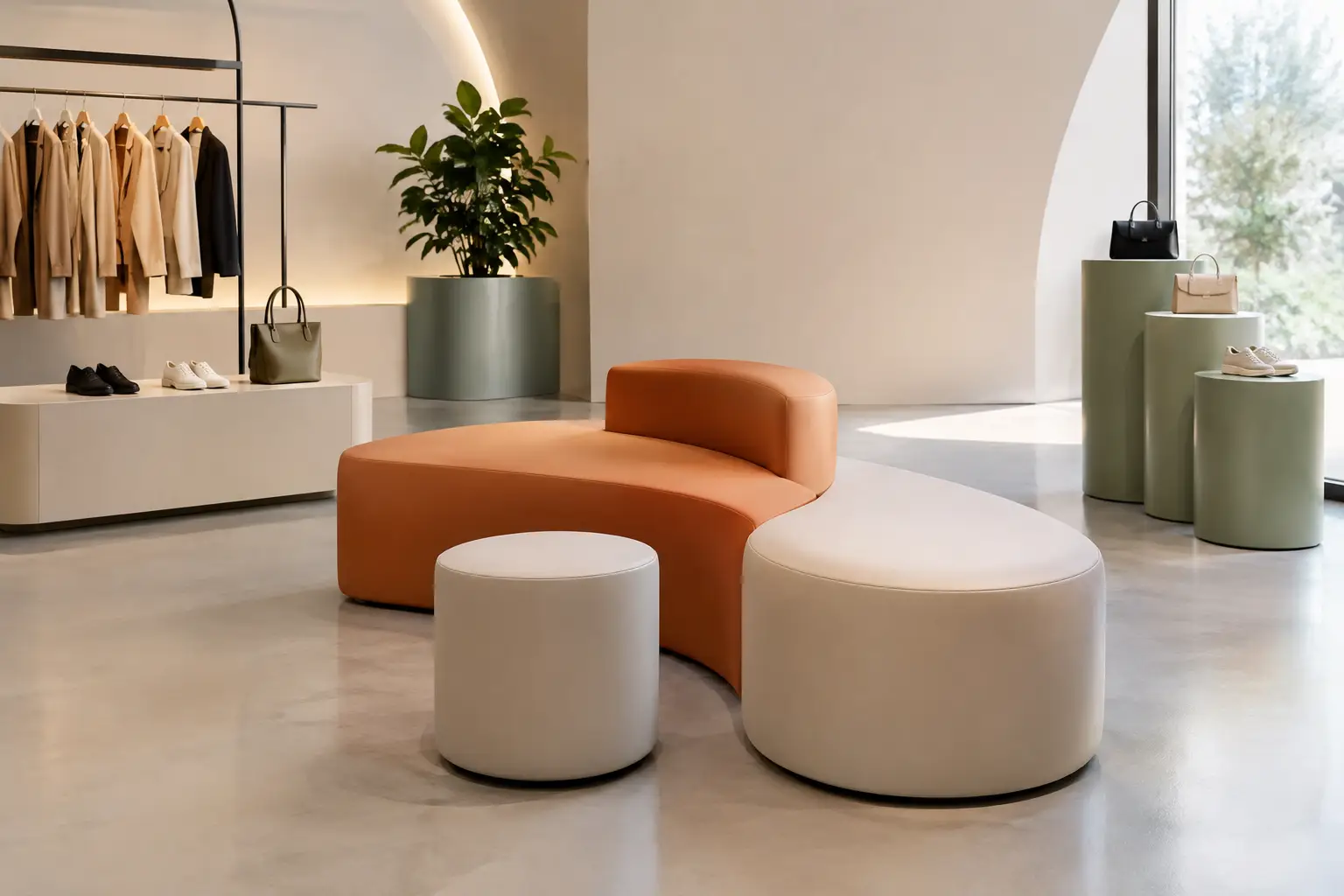
A retail display project is rarely won by more shelving alone. The spaces that hold attention are the ones that give products a setting, a rhythm, and a reason to be photographed, explored, and remembered. For retail designers, the assignment is not simply to show inventory. It is to turn a brand’s physical language into an environment customers can move through.
That demands more than a strong concept rendering. Retail is hard on materials, crowded at peak hours, constantly reset by staff, and judged in seconds by passing customers. A successful display must create impact from a distance while remaining useful, maintainable, and commercially credible at close range.
Start the Retail Display Project With a Spatial Idea
The strongest concepts begin with one clear spatial gesture. It might be a saturated seating landscape that anchors a beauty launch, a sequence of soft sculptural plinths that leads customers through a footwear collection, or an oversized branded form that makes an otherwise conventional store feel unmistakably its own.
This gesture should answer a practical question: what must the customer notice, understand, or do here? A display designed for discovery needs circulation and moments of pause. A campaign installation may prioritize a photographic focal point. A waiting area needs comfort, durability, and a form that supports the identity of the space without competing with merchandise.
Avoid treating display furniture as a separate decorative layer applied after the plan is complete. Benches, podiums, planters, lounge elements, and feature forms can shape the customer journey as effectively as walls and lighting. Their scale can slow movement, direct sightlines, create a threshold, or define a zone without adding visual heaviness.
The trade-off is clear. A highly expressive object can become the destination, but if it dominates the product or obstructs circulation, it has missed its role. The best retail environments balance visual theater with enough open space for customers to browse comfortably.
Design for Recognition From Every Distance
Retail spaces are read in layers. From the street or mall corridor, the display needs a silhouette that registers immediately. From several feet away, color, proportion, and composition should signal the campaign or category. At hand level, the finish must reward touch and withstand it.
Sculptural coated foam is especially useful when the concept relies on rounded volumes, monolithic shapes, exaggerated proportions, or forms that would be difficult to produce in conventional hard furniture. It allows designers to work with soft geometry while creating a finished object with a continuous, highly durable surface.
That continuity matters. A display made from one flowing form feels intentional, while assembled components can read as temporary unless their joins and details are handled with great discipline. For brands built around play, movement, wellness, innovation, or bold color, a continuous volume can make the brand message physical.
Color should be specified with equal care. A signature hue can create instant recognition, but retail lighting changes it. Warm decorative light, daylight from a storefront, and bright task lighting will each shift how a surface appears. Review physical samples under representative conditions before finalizing a color, especially for brand-critical installations.
Build the Brief Around Real Retail Use
A persuasive retail display project becomes buildable when the design brief includes operational facts early. This is where visual ambition meets fabrication expertise. A manufacturer needs to know whether a form is for sitting, leaning, displaying product, receiving foot traffic, or simply creating a visual landmark. Each purpose affects internal construction, dimensions, surface specification, and edge treatment.
Provide the expected user load, product weight, access needs, cleaning requirements, and installation conditions. Is the piece permanent, seasonal, or traveling from store to store? Will staff move it during visual merchandising resets? Does it need to align precisely with a fixture, graphic wall, or lighting feature? These details are not administrative extras. They determine whether the finished installation performs as convincingly as the concept image.
For seating and public-touch surfaces, specify the expected intensity of use. A quiet appointment-based showroom calls for a different solution than a flagship store with continuous weekend traffic. For display plinths, consider how products will be secured, whether cables must be concealed, and how frequent changes in assortment may affect the layout.
It also helps to establish where customization creates value and where repetition is smarter. A single hero object may justify complex geometry and a custom color match. Repeated risers or secondary seating can often use a disciplined family of forms to control budget and simplify replacement planning. Originality does not require every piece to be unrelated.
Material Choice Is Part of the Customer Experience
Retail materials are often chosen for appearance, then challenged by reality. Fingertips leave marks. Shopping bags scrape corners. Cleaning crews work quickly. Window-facing displays experience strong light exposure. The right material specification anticipates these conditions instead of treating them as afterthoughts.
Coated foam offers a distinct combination of expressive form and tactile resilience. Its surface can be specified for different visual and functional demands, from refined interior applications to harder-wearing use in high-contact environments. Because the coating wraps the form, it also avoids many of the seams, loose upholstery, and exposed edges that can complicate cleaning and disrupt a minimal design language.
No material is universal. A glossy or highly saturated finish can amplify visual impact but may make surface marks more apparent under sharp lighting. Deeply textured forms can create drama, yet they may be less appropriate where product photography requires clean, neutral backgrounds. Outdoor or semi-outdoor installations introduce further variables, including drainage, UV exposure, and temperature shifts.
The right question is not, “What is the most durable material?” It is, “What finish supports the intended experience and the actual use conditions?” A premium boutique may prioritize a precise visual finish. A public-facing activation may place higher value on easy maintenance and resistance to heavy contact. Both can be designed with conviction when the specification follows the brief.
Coordinate Fabrication Before the Design Freezes
A concept should be reviewed for production logic before every dimension is locked. This does not mean reducing the design to standard furniture. It means using fabrication knowledge to preserve the idea while resolving how it will be made, transported, installed, and maintained.
Early coordination can identify where a large sculptural element should separate into manageable sections, how joints can be hidden within the geometry, and what tolerances are needed against walls, floors, and existing fixtures. It can also clarify whether a form needs internal reinforcement, a weighted base, floor fixing, or clearance for electrical and data connections.
This stage is particularly valuable for branded shapes and unconventional seating. A form that looks simple in elevation may create complex stress points or installation challenges once people sit on it, lean against it, or move around it. Technical development protects the concept from last-minute compromises that make the final result look ordinary.
Sixinch approaches this conversation as a fabrication partner, translating bold design intent into coated-foam objects that can be manufactured for commercial environments. For architects and retail designers, that means the conversation can begin with a sketch, a model, or a clear visual direction rather than a catalog constraint.
Let the Display Change Without Losing Its Identity
Retail is not static. Product drops, seasonal stories, and local campaigns all require change. A fixed architectural statement can coexist with flexible display elements when both are organized around the same design language.
Create a hierarchy: one or two permanent gestures establish recognition, while smaller objects support merchandising changes. Mobile benches, freestanding display forms, and modular podiums can be repositioned without making the store feel reinvented every month. Consistency comes from repeated proportions, color logic, and surface character, not from locking every object in place.
The closing test for any retail display project is simple: if the merchandise changes tomorrow, will the space still feel unmistakably like the brand? When the answer is yes, the display has moved beyond decoration. It has become a durable piece of brand architecture, ready to support the next story.