
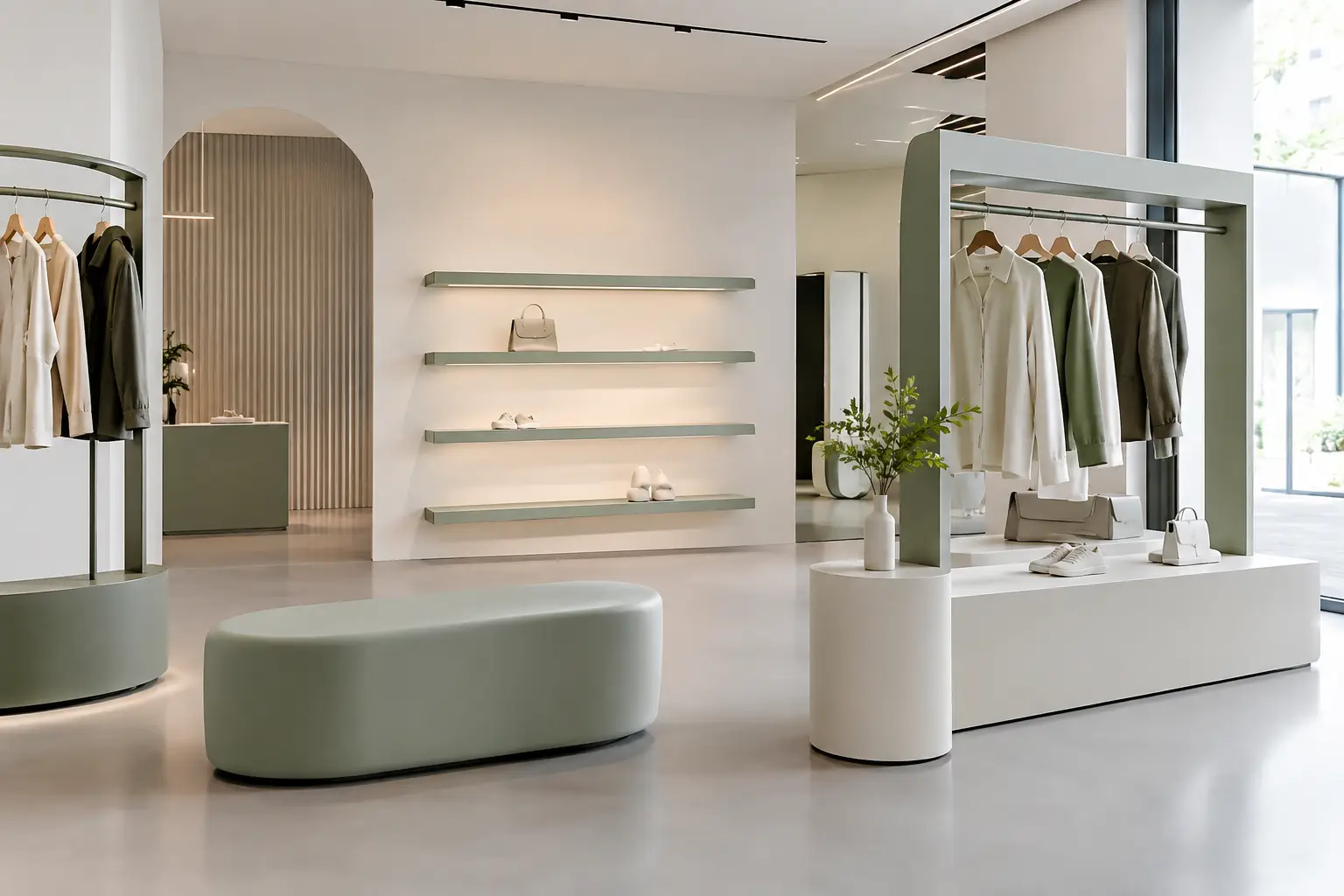
A fixture can hold a product, but the right fixture can also control pace, frame a point of view, and make a store feel impossible to confuse with the one next door. This guide to retail fixture design is for teams treating the physical environment as part of the brand itself – not as a neutral backdrop for merchandise.
For retail architects, interior designers, and visual merchandising teams, the challenge is rarely finding another shelf. The challenge is building a system that gives products presence, supports real operations, and creates a spatial experience worth entering. That calls for a fixture strategy with equal attention to form, movement, material, and maintenance.
Start With the Customer Journey, Not the Fixture
Retail fixtures should follow the path shoppers take through the space. Before selecting forms or finishes, map where people enter, pause, browse, interact with staff, and make decisions. The plan should establish a clear visual hierarchy: a strong first impression, focal moments that pull visitors farther in, and quieter support zones that keep the environment organized.
A high-impact display near the entrance can set the tone, but it should not become a wall that blocks orientation. Lower sculptural seating, freestanding product plinths, or open-frame display elements can create an arrival moment while preserving sightlines into the store. In a compact footprint, this transparency is often more valuable than adding another merchandising surface.
The right circulation pattern depends on the retail model. A luxury showroom may benefit from a slow, gallery-like route with generous negative space. A beauty, apparel, or lifestyle store may need a more flexible loop that encourages discovery and accommodates frequent floor-set changes. The fixture layout has to support the intended behavior rather than impose a fashionable geometry on the room.
A Guide to Retail Fixture Design Begins With Product Behavior
The shape, scale, and handling requirements of the merchandise should lead the design. Products that shoppers need to touch, compare, or test demand accessible displays and enough room for people to linger. Products that carry high value or require staff assistance may need more controlled presentation, with deliberate viewing distances and secure storage integrated close by.
Consider how the product is encountered. Is it seen from across the room, sampled at arm’s length, tried on, opened, or carried to a fitting room? Each action changes fixture depth, height, edge detailing, lighting, and the amount of space needed around the display. A display that photographs well but makes replenishment awkward will create friction every day after opening.
Product density is another design decision with brand consequences. Sparse presentation can make a collection feel considered and premium, but it requires a disciplined replenishment plan and enough inventory elsewhere in the space. Dense presentation communicates abundance and choice, yet can quickly read as clutter if the fixture rhythm is not clear. There is no universal right answer. The desired price perception, product cadence, and staffing model all matter.
Build a Hierarchy of Fixture Types
The most memorable retail interiors rarely rely on one repeated fixture alone. They combine a few distinct roles into a coherent family: feature pieces for storytelling, perimeter elements for depth of assortment, flexible mid-floor units for discovery, and operational components that keep the store working.
Feature fixtures deserve the greatest formal freedom. They may use oversized volume, unexpected curvature, branded color, or an architectural silhouette that can be recognized from outside the store. Their job is to create a visual anchor, not to carry every SKU. A sculptural podium or soft-edged display island can bring warmth to a technical product category, while a dramatic wall form can give a small collection the authority of an exhibition.
Perimeter fixtures usually need to work harder. They often carry the most merchandise, incorporate storage, and adapt to changing campaigns. Design them as a long-term framework with modular zones, adjustable display positions, and concealed access points. That approach makes it possible to refresh product stories without rebuilding the room.
Mid-floor fixtures should earn the area they occupy. They can slow customers down, organize newness, or provide a tactile interaction point. Keep their proportions low enough to protect long views unless they are intentionally creating a destination. When all fixtures compete for height and attention, the room loses its focal structure.
Use Material Contrast With Purpose
Material selection tells customers what kind of retail experience they are entering before they read a sign. Hard, reflective finishes can make product colors pop and support a precise, high-energy atmosphere. Warm wood, textile, and soft-touch surfaces can make browsing feel more personal. Stone-like surfaces or coated sculptural forms can add permanence and visual weight without making a space feel heavy.
Contrast is most effective when it reinforces a function. A tactile lounge element can signal that customers are welcome to pause. A matte plinth can make glossy packaging stand out. A continuous colored fixture can carry a brand through several zones without relying on repetitive graphics.
For custom installations, coated foam offers a different design language from conventional casework. It can create monolithic seating, rounded display forms, integrated planters, and expressive volumes with a durable, easy-to-clean skin. Sixinch applies this capability to furniture and architectural pieces where a standard rectilinear fixture would limit the concept. The trade-off is that highly sculptural elements require early coordination around dimensions, mounting, load requirements, and the way they meet harder construction materials.
Design for Change, Replenishment, and Repair
A retail fixture is used by staff far more often than it is admired by a visitor. Teams replenish stock, change signage, clean surfaces, move product, access power, and occasionally repair damage. Those realities should influence decisions from the first sketch.
Ask where extra inventory lives and how it reaches the sales floor. If staff must cross the entire store or dismantle a display to replenish a popular item, the design is working against the operation. Integrated drawers, concealed cabinets, under-plinth storage, and back-of-house adjacency can protect the visual calm of the space while reducing labor.
Flexibility needs a clear purpose. Adjustable shelves and movable components are valuable when collections change often. In a highly curated brand environment, too much adaptability can lead to visual inconsistency and loose-looking displays. Some fixtures should be designed as fixed statements, while others serve as the changeable infrastructure around them.
Durability is not only about selecting tough materials. It is about anticipating points of contact: corners hit by carts, bases kicked by shoes, surfaces exposed to oils or cosmetics, and seams where dust gathers. Specify finishes that can be cleaned with realistic routines, not only with idealized care. Request samples, test cleaning products, and examine how colors read under the store’s actual lighting conditions.
Coordinate Light, Power, and Graphics Early
Retail fixture design becomes far more convincing when lighting, power, and brand communication are integrated rather than added later. A display intended to hold illuminated product, screens, charging points, or digital content needs concealed pathways and service access. Retrofitting these elements can compromise the cleanest forms.
Light should reveal material, texture, and product detail without flattening the room. Use focused accents to establish priority, then support them with ambient light that makes circulation comfortable. Glossy or brightly colored fixtures may need testing to avoid glare, while textured surfaces can benefit from grazing light that emphasizes their form.
Graphics deserve similar restraint. A fixture can carry a logo, message, or campaign layer, but not every surface needs to speak. When the fixture itself is distinctive, fewer graphic interventions often produce a stronger branded environment. Leave room for the architecture and the products to hold attention.
Prototype the Moments That Matter
Renderings establish intent, but they cannot fully reveal a fixture’s ergonomics, stability, finish quality, or visual scale. For ambitious designs, prototype the high-risk component or build a full-size mockup of the most important customer interaction. Test how products sit on it, how a staff member accesses storage, and whether the form still feels balanced at human scale.
This is particularly valuable for custom curved, soft, or sculptural fixtures. A small shift in radius, edge height, or plinth proportion can change the entire character of the object. Early prototyping protects the concept while giving fabricators the information needed to engineer it responsibly.
The most effective retail fixture design does not ask every object to do everything. It gives each piece a role, lets materials express the brand, and makes daily use feel considered. When the environment is designed with that level of intent, shoppers may not describe the fixture itself – but they will remember how the store made them feel.