
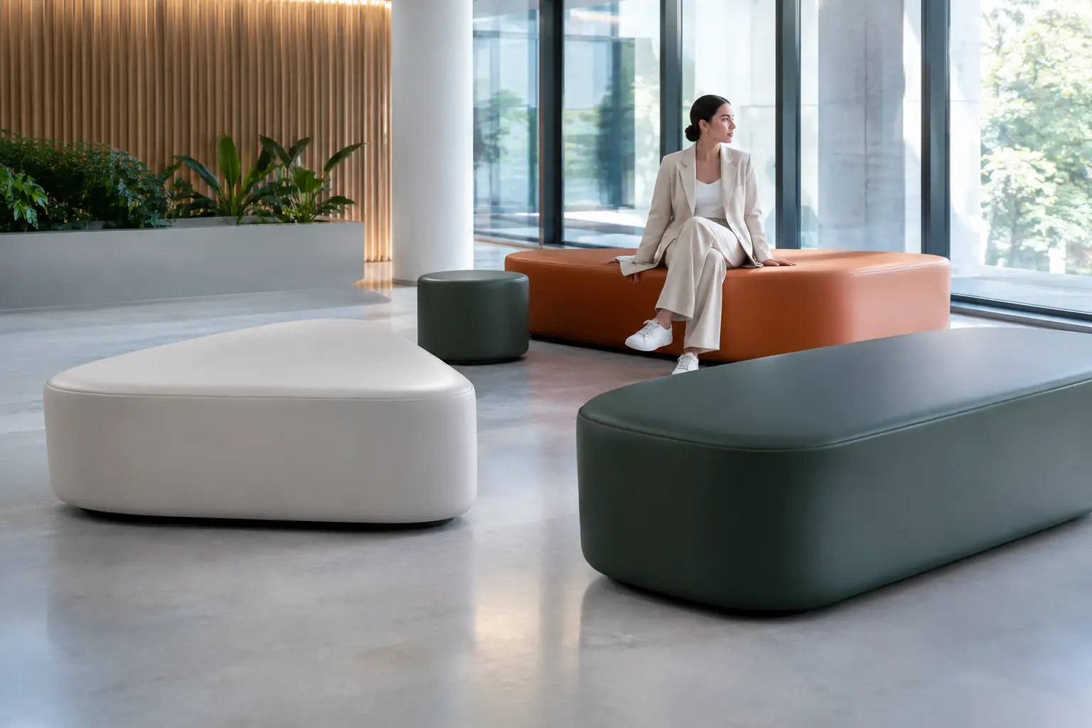
A seating concept can be visually exceptional on a rendering and still fail on day one if its surface finish is wrong. The question of which finish suits public seating is not simply about choosing a color or sheen. It is about defining how an object will be touched, cleaned, exposed, photographed, and remembered.
For architects and designers, the finish is where a public seating piece becomes a real material decision. It determines whether a sculptural bench feels inviting or untouchable, whether a lounge installation withstands constant use, and whether a branded environment retains its intended visual force after hundreds of visitors have passed through it.
Which Finish Suits Public Seating? Start With the Setting
There is no universal finish for public seating because public space is not one condition. A hospitality lounge, an airport waiting area, a museum gallery, a school commons, and a poolside terrace may all require high-use seating, but their surface demands are fundamentally different.
Begin with the pattern of contact. A reception bench may receive steady but relatively careful use. A retail pop-up can experience intense, unpredictable traffic, bags dragged across surfaces, and frequent repositioning. Outdoor seating must also contend with sunlight, rain, temperature swings, airborne pollution, and the practical reality of cleaning crews working quickly between guests.
The right finish should support the intended behavior of the space rather than force the design into a generic commercial look. This is especially relevant for coated foam furniture, where fluid forms, continuous surfaces, and custom geometries can be specified without introducing the seams, joints, and visual interruptions common to conventional upholstered construction.
Matte, Satin, or Gloss: Choose the Visual Temperature
Surface sheen changes the character of a form before anyone sits on it. It also affects how easily the surface reveals fingerprints, dust, scuffs, and uneven light.
Matte finishes for calm, tactile environments
A matte finish absorbs light and gives seating a softer, more architectural presence. It works particularly well in galleries, wellness spaces, libraries, hospitality interiors, and workplace lounges where the furniture should feel grounded rather than theatrical. Matte surfaces can make large volumes appear less imposing and help saturated colors read with more depth.
The trade-off is maintenance visibility. A very deep matte black, for example, can show hand marks, lint, and pale abrasion more readily than a mid-tone shade. That does not rule it out for public use, but it does mean the color and cleaning plan must be considered together. Matte is strongest when the desired experience is warm, restrained, and touch-oriented.
Satin finishes for versatile public use
Satin often provides the most flexible balance for public seating. It reflects enough light to define sculptural curves and make colors feel alive, while remaining less visually demanding than high gloss. For reception areas, education projects, retail interiors, museums, and shared workspaces, this middle ground can support both a polished appearance and daily practicality.
A satin finish is also useful where seating must work across changing daylight and artificial lighting conditions. It gives designers a controlled highlight on rounded edges and molded profiles without turning every contact point into a visible reflection. When a project needs a confident finish that does not dominate the room, satin is usually the first surface to test.
Gloss finishes for statement pieces
Gloss is not the default answer for high-traffic seating, but it can be exactly right when visual impact is the brief. It amplifies color, sharpens silhouettes, and gives biomorphic or graphic forms a distinctly object-like presence. In experiential retail, events, nightlife, branded installations, and hospitality settings with managed maintenance, gloss can turn seating into a focal point.
Its limitations are equally clear. High-gloss surfaces reveal fingerprints, scratches, and reflected imperfections more easily, particularly under direct spotlights. Use gloss intentionally on pieces that are meant to perform visually, not simply disappear into the background. A dramatic finish deserves a maintenance strategy that protects its drama.
Texture Should Support Grip, Comfort, and Cleaning
Texture is one of the most underestimated specification choices in public seating. A completely smooth surface can appear precise and contemporary, but it may feel slippery in outdoor settings or under certain clothing fabrics. A lightly textured coating can add tactile warmth, reduce the visual impact of minor wear, and make the surface feel less industrial.
The key is moderation. Deep texture can collect dust and make cleaning more labor-intensive. In food-service areas, transit-adjacent locations, and family-focused public environments, overly pronounced texture can become a hygiene concern if not selected carefully. Fine, controlled texture tends to offer the better compromise: enough depth to soften the surface and disguise everyday marks, but not enough to create difficult cleaning points.
Texture also changes how a color behaves. A smooth, saturated red may feel glossy and graphic even in a low-sheen finish, while the same red with fine texture can feel more material and less synthetic. Sample review under actual project lighting is essential. Designers should assess not only the color chip but also how the selected texture bends around curves, corners, and large continuous surfaces.
Outdoor Public Seating Needs a Different Standard
Outdoor seating has to remain convincing after exposure, not just at handover. UV resistance, water management, temperature response, and cleanability all matter. The most suitable finish will depend on whether the installation is fully exposed, partially sheltered, or positioned under a canopy where indirect weather still reaches the furniture.
For exterior landscapes, a low-to-medium sheen is often more forgiving than gloss. It reduces glare in direct sun and avoids turning a seating element into a mirror under bright conditions. Mid-tone colors, earthy neutrals, and carefully selected bold hues can also conceal dust and minor surface residue better than pure white or highly saturated dark colors.
That said, public landscape furniture should not be reduced to safe neutrals. Strong color can establish wayfinding, reinforce identity, or create a memorable social destination. The finish must simply be specified as part of an exterior system, with appropriate performance expectations and a realistic maintenance schedule. Bold forms deserve materials that are engineered to stay bold outdoors.
Match the Finish to the Maintenance Reality
The best finish on paper is not necessarily the best finish for the client. Ask early who will clean the seating, how often, with what products, and under what time pressure. A boutique hotel with dedicated housekeeping can support a more exacting surface than a busy university commons with limited facilities resources.
Avoid specifying based on appearance alone. White may be perfect for a controlled showroom or gallery installation, while a softer gray, clay, blue, or custom mid-tone can be the wiser choice for a heavily used public lounge. Likewise, a refined matte finish may suit a quiet cultural project, while satin better supports the fast-paced turnover of a commercial setting.
Cleaning guidance should be shared with the facilities team before installation. Coated surfaces are valued for their wipeable, continuous character, but even high-performance materials need compatible cleaning methods. Harsh abrasives, unsuitable solvents, and neglected spills can shorten the visual life of any finish. Specification is only half the decision. Care is what preserves it.
Use Finish to Strengthen the Design Intent
Public seating often has a larger job than offering a place to sit. It can organize circulation, establish a social zone, carry a brand color, soften a large architectural volume, or act as a visual landmark. The finish should reinforce that role.
A single sculptural seating island in a hotel atrium may call for a saturated satin color that catches ambient light from every direction. A sequence of benches in a museum may benefit from a quiet matte finish that respects the surrounding works. In a retail setting, a glossy accent piece can create a moment of instant recognition, while more tactile companion seats keep the environment comfortable and usable.
This is where custom fabrication creates meaningful freedom. Rather than selecting a stock upholstery category and accepting its limits, designers can coordinate form, color, texture, and sheen as one coherent material language. Sixinch applies this approach to design-led seating, translating expressive concepts into coated, production-ready objects built for real commercial environments.
Specify Samples Before Final Approval
Digital visuals cannot show how a finish will behave under a lobby’s lighting, in direct sun, or after repeated contact. Request physical samples and review them in the actual setting whenever possible. Place them beside flooring, wall finishes, metals, and fabrics. Test them with the cleaning products likely to be used on site. If the project is exterior, observe them in daylight rather than relying on an indoor sample review.
It is also worth testing the sample as people will experience it. Sit on it. Run a hand across it. Look at it from standing height and from across the room. A public seating finish is successful when it performs at every distance: as a strong architectural gesture, as a tactile surface, and as a practical part of daily operations.
Choose the finish that lets the form remain memorable after the first photograph, the first busy season, and the thousandth person who takes a seat.