
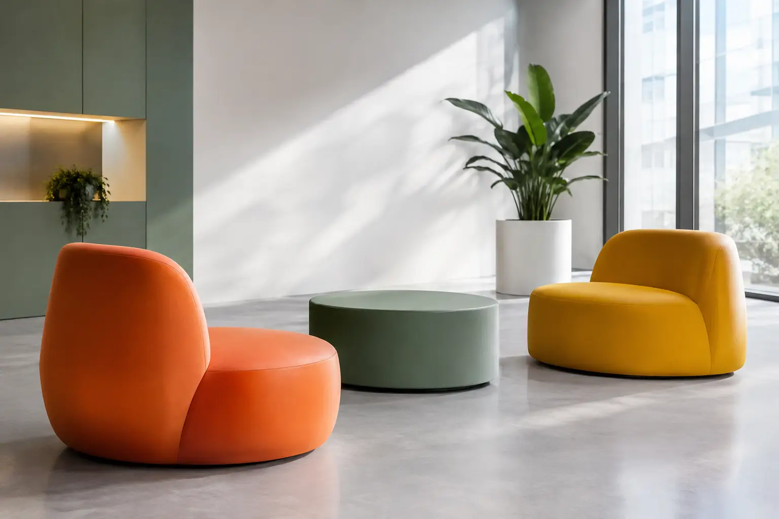
A lobby chair in the exact red of a company mark can feel either unforgettable or painfully literal. The difference is not the color alone. It is the discipline behind the form, scale, finish, and placement. So, can furniture reflect brand colors? Absolutely. For architects, interior designers, and hospitality teams, furniture can turn a visual identity into an environment people can physically experience.
The best branded interiors do not simply apply a logo palette to every available surface. They use color as part of a larger spatial language. A sculptural bench, rounded lounge seat, oversized pouf, or modular landscape element can carry brand recognition while giving the space a purpose beyond decoration.
Can furniture reflect brand colors without looking promotional?
Yes, provided color is treated as an architectural decision rather than a marketing afterthought. Furniture is particularly effective because it occupies the human layer of a space. People sit on it, gather around it, photograph it, and remember it. A carefully selected brand color on a signature seating element has more presence than the same color used as a small graphic accent.
The objective is not necessarily an exact logo match everywhere. Brand palettes often include a primary color, supporting colors, neutrals, and tonal variations. Translating that system into furniture may mean using a saturated hero color on one large communal seat, a darker tonal shade for smaller pieces, and a quiet neutral for surrounding elements. The environment remains unmistakably on-brand without becoming visually exhausting.
This is especially useful in hospitality, workplace, retail, education, and public interiors, where furniture must establish atmosphere while meeting daily functional demands. In these spaces, color has to work from a distance and at close range.
Start with the role color needs to play
Before specifying a finish, determine what the brand color should accomplish in the project. A reception area may need an immediate visual anchor. A retail environment may use color to define a product story or customer path. A campus lounge may need distinct zones that support orientation and social use. The same blue can be expressive, directional, calming, or institutional depending on how it is deployed.
A useful question is whether the furniture should be the primary brand gesture or part of a wider composition. If a space already has colored ceilings, graphics, lighting, and flooring, furniture may need to provide contrast or tonal relief. If the architecture is restrained, furniture can take on a more dramatic role through volume and saturation.
Scale matters just as much as hue. A single large orange seating landscape can create a strong identity moment. Twenty small orange chairs spread evenly across a room may read as a standard procurement decision instead of a deliberate concept. Concentrating color often creates more impact and allows the rest of the palette to breathe.
Let form carry as much identity as color
When a project relies only on a branded shade, it can become interchangeable. Shape gives color a recognizable presence. A low, flowing bench suggests something very different from a crisp geometric block, even when both are finished in the same color.
This is where custom furniture becomes more than a color-matching exercise. Curved forms can encourage informal gathering in a hotel lounge or public atrium. Oversized, playful volumes can make a retail activation feel immersive. A precise modular system can bring clarity to a corporate collaboration space. The form should express how the brand behaves, not just what color it uses.
Coated foam fabrication offers unusual freedom in this process. It allows designers to develop soft-looking, sculptural objects with a continuous, resilient skin and without the visual interruption of conventional upholstery seams. Complex radii, monolithic volumes, integrated backs, and unexpected silhouettes become viable production considerations rather than purely conceptual sketches.
At Sixinch, this capability supports projects where a furniture piece needs to function as seating, a color field, and a signature spatial object at the same time. The strongest result comes from resolving all three roles together from the earliest design stage.
Choose a finish that supports the intended experience
Brand color is never experienced as a flat swatch once it enters a built environment. Light, surface texture, sheen, surrounding materials, and the object’s geometry all change how the color is perceived. A warm red can appear almost burgundy under low hospitality lighting, while a bright white setting may make it appear more energetic. Sample review in the actual project conditions remains essential.
The finish also affects the emotional register of the furniture. A smooth coated surface can make a vivid color feel clean, graphic, and architectural. Softer visual textures may suit spaces intended to feel domestic or relaxed. For outdoor settings, the material specification must also account for UV exposure, temperature shifts, drainage, cleaning requirements, and the way the chosen tone will weather over time.
This is not an argument against bold colors. It is an argument for specifying them with technical intent. Highly saturated pieces can be exceptionally durable visual assets when the material system is selected for the environment, maintenance plan, and expected level of use.
Build a palette for the whole room, not each individual piece
A brand-led furniture scheme needs hierarchy. One color should lead, while the remaining colors support it. In practice, that may mean a primary brand hue on a statement sofa or central seating island, a secondary tone on adjacent stools, and neutral pieces that keep circulation areas visually calm.
Avoid assigning every item a different palette color simply because it appears in the brand guidelines. Furniture is three-dimensional and often large in volume. What looks balanced on a digital brand board can feel fragmented once translated into a room full of objects.
Consider the existing materials as part of the palette. Wood, stone, polished concrete, metal, greenery, wall finishes, and daylight all introduce color information. A teal seat against warm oak can feel richer and more inviting than the same seat against a similarly cool floor. The goal is not exact replication of a graphic identity. It is a convincing spatial interpretation of it.
Use contrast to guide behavior
Color can also help people understand how to use a space. A distinct seating color can identify a waiting zone, a meeting point, or a casual work area without adding signs everywhere. In large public interiors, this kind of visual cue improves legibility while contributing to the brand experience.
The contrast should be intentional. High contrast supports visibility and energy. Low contrast creates a more refined, immersive atmosphere. Neither is universally better. A youth-oriented retail concept may benefit from immediate visual punch, while a premium wellness setting may need a quieter tonal relationship that rewards closer attention.
Specify for real use, not just the render
A striking branded furniture concept has to survive contact with the public. This is where early collaboration between designer, manufacturer, and client protects the design. Discuss the anticipated traffic, cleaning products, indoor or outdoor placement, weight distribution, floor conditions, fire requirements, and any accessibility considerations before finalizing the form and finish.
Custom work also requires clear control of color expectations. Digital renderings are useful, but they cannot replace physical samples. Review the color against adjacent materials and under representative lighting. If the project includes multiple sites or phased installation, establish a reference sample and approval process so the palette remains consistent.
There can be practical reasons to adapt a brand color rather than match it perfectly. A slightly deeper tone may conceal wear better in a high-traffic terminal. A less reflective finish may reduce glare in a sunlit atrium. A complementary color may offer better contrast for users with low vision. These are not compromises in brand expression. They are signs that the concept has been designed to perform.
Make the branded moment worth remembering
Furniture reflects brand colors most successfully when it creates a place people want to inhabit, not merely a backdrop they pass through. The color should reinforce a feeling: confidence, curiosity, comfort, playfulness, precision, or calm. Form, material, and spatial placement then make that feeling credible.
For a branded interior to stay memorable, give its strongest color a purpose. Let it gather people, define a destination, soften a hard architectural volume, or turn an overlooked area into a moment of encounter. When color is attached to a useful, beautifully made object, it stops behaving like decoration and starts becoming part of the brand’s lived experience.