
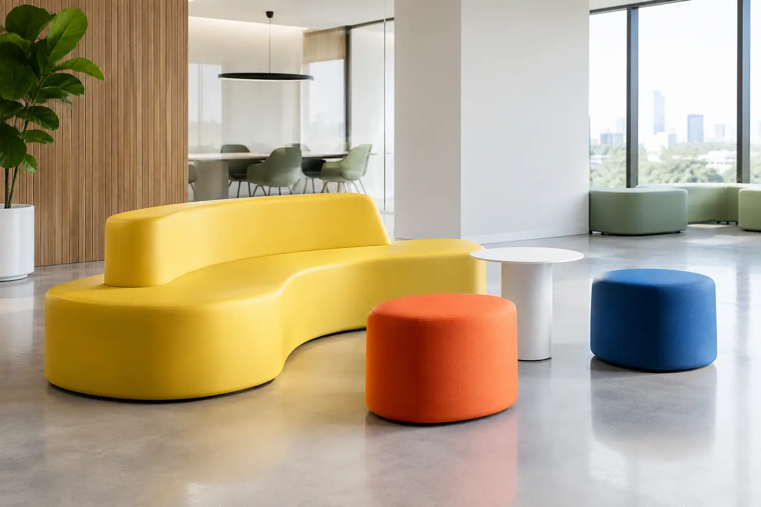
A saturated lounge chair can pull a hotel lobby into focus before a guest reaches the desk. A sculptural yellow bench can make a circulation zone feel intentional rather than leftover. Colorful contract interiors do not rely on decoration alone. They use color as a spatial tool – one that directs movement, signals brand character, and gives people a reason to remember a place.
For architects and interior designers, the challenge is not finding a bold hue. It is specifying color with enough discipline that the environment still works under daily use, mixed lighting, cleaning protocols, and changing tenant or guest expectations. The strongest projects make color feel inevitable because form, material, placement, and performance were considered together.
Why Color Has a Bigger Job in Contract Spaces
In residential settings, color can be personal and flexible. In a contract environment, it must communicate at scale. It may need to distinguish a quiet work area from a social one, reinforce a retail identity, or make a public waiting space feel less institutional. It also needs to coexist with signage, flooring, architectural finishes, and the visual noise created by people moving through the space.
This is why a colorful interior should begin with a behavioral question, not a paint swatch. What should visitors notice first? Where should they gather? Which areas need energy, and which need visual rest? A bright seating island near a reception point can create immediate orientation. A deeper, more restrained color family in a lounge can encourage a slower pace and longer dwell time.
Color is particularly effective when it is carried through volume. A colored wall is a backdrop. A colored bench, planter, pouf, or curved seating element becomes an active object in the room. It affects sightlines, circulation, and the way people occupy the space.
Colorful Contract Interiors Need a System
A successful palette has hierarchy. Without one, a high-impact scheme can quickly become a collection of competing moments. That does not mean every project needs neutral walls and a single accent color. It means each color decision needs a job.
Start by establishing a dominant field: perhaps a mineral gray floor, warm timber, dark tile, or a light architectural shell. Then determine where concentrated color will do the most work. In many hospitality, workplace, and retail projects, furniture is the ideal carrier because it introduces intensity without permanently committing every surface.
A useful approach is to work across three levels. The first is the base palette that holds the room together. The second is a recognizable brand or project color used in major focal points. The third is a smaller set of supporting colors that adds depth and prevents the scheme from feeling flat. This allows a red lounge landscape, for example, to feel deliberate rather than isolated when it is supported by related coral, burgundy, or clay details elsewhere.
The scale of each application matters as much as the hue. A vivid cobalt used on one small stool reads as an accent. The same cobalt across a long modular sofa becomes an architectural event. Neither is inherently better. The right choice depends on the desired energy, ceiling height, available daylight, and the visual density of surrounding finishes.
Use Form to Give Color Presence
Bright color on conventional furniture can look graphic, but color on an unconventional form has another effect: it amplifies the silhouette. Rounded profiles, soft monolithic volumes, asymmetrical benches, and oversized poufs can create visual impact even from a distance. The form remains legible because the color makes its edges and mass more apparent.
This is where coated foam construction offers unusual freedom. It supports soft, sculptural geometries without asking the designer to treat furniture as a standard set of frames, legs, and upholstery panels. A seating element can curve around a column, rise into a landscape-like mound, or become a custom brand gesture in three dimensions.
The trade-off is real. Complex forms require careful coordination around dimensions, joins, ergonomics, access routes, and fabrication tolerances. A dramatic concept that blocks circulation or provides too little usable seat depth will not perform simply because it photographs well. Early prototypes, drawings, and material samples help convert expressive ideas into reliable contract pieces.
Specify for Light, Touch, and Maintenance
Color is never experienced in isolation. Daylight can make a cool green appear crisp in the morning and muted by afternoon. Warm hospitality lighting can enrich red and terracotta while pushing pale yellow toward cream. Before finalizing a palette, review physical samples under the actual lighting conditions whenever possible. Digital renders are valuable for composition, but they cannot fully predict surface reflectance or perceived saturation.
Material texture also changes how color behaves. Matte surfaces tend to absorb light and give saturated colors a grounded, substantial quality. Glossier finishes can feel more energetic and graphic, but may reveal fingerprints, scuffs, or uneven lighting more readily. A textured coating can introduce depth, while a smoother finish may better support a clean, monolithic visual language.
For public interiors, maintenance is part of the color strategy. White and very pale tones can be striking, especially in gallery-like or wellness-focused settings, yet they demand a maintenance plan appropriate to the traffic level. Deep colors often conceal incidental marks better, but can still show lint, dust, or abrasion depending on the finish. Mid-tones, patterned visual fields, and thoughtfully selected coating textures can offer a more forgiving balance.
Ask practical questions early: How will the piece be cleaned? Will bags, shoes, carts, or luggage repeatedly contact the surface? Is the setting exposed to food and beverages? Are replacement components possible if a high-traffic item is damaged? Color choices become much stronger when their operational consequences are considered alongside their visual appeal.
Zone Large Spaces Without Building More Walls
Open-plan spaces often need clarity without enclosure. Color can establish that clarity while preserving visibility and flexibility. A cluster of orange seating may define the social center of a coworking floor. A calm blue-green arrangement can signal a focused waiting area in a healthcare setting. In retail, color-blocked furniture can create a transition between product stories or services without adding permanent partitions.
The most convincing zones combine color with a change in furniture type, scale, or orientation. If every seat has the same profile and only the upholstery color changes, the distinction may feel superficial. A lounge zone can be lower and more enveloping; a quick-touchdown zone can be more upright; a communal zone can be longer, broader, and deliberately visible.
This strategy is especially valuable in public spaces where people need intuitive cues. Visitors may not read a sign before choosing where to sit, but they understand an inviting circular pouf group, a linear waiting bench, or a bright communal table zone almost immediately.
Make Brand Expression Spatial, Not Literal
Branded interiors often default to applying a logo color everywhere. That approach can be effective in small doses, but it tends to lose sophistication when it becomes repetitive. A stronger move is to translate the brand’s character into a color relationship, a sculptural language, or a sequence of moments.
A playful brand may use vivid contrasts and generous rounded forms. A technology-led brand may pair a precise, high-chroma accent with restrained neutrals and sharply defined volumes. A hospitality concept may work with layered sunset tones that shift from reception to lounge to dining. The result can feel unmistakably aligned without turning every piece into a branded object.
Customization matters here because a recognizable environment is rarely built from standard dimensions alone. A custom sofa can follow a curved wall. A set of colored planters can establish rhythm through an atrium. A bench can incorporate a specific radius, height, or color placement that becomes part of the project’s visual signature.
Design for Longevity, Not Just the Opening Night
Bold interiors are sometimes treated as inherently short-lived. In reality, color becomes dated when it is used without a concept or when every decision is tied to a passing visual trend. A clear palette, strong proportions, and durable materials can make a colorful project feel relevant for years.
It helps to place the most expressive colors where they can be refreshed or reconfigured over time. Freestanding seating, poufs, and planters offer more future flexibility than an entire fixed architectural envelope. Meanwhile, the base finishes can remain calm enough to support a later evolution. This is not an argument for timid design. It is an argument for locating boldness where it can continue to work.
For projects that require forms beyond the expected, Sixinch brings color, coated-foam craftsmanship, and custom fabrication into the same conversation. The opportunity is not simply to select a brighter object. It is to create a spatial element with the presence, comfort, and durability to earn that brightness every day.
The most memorable contract interiors do not use color to ask for attention. They give color a purpose, then let form and performance make the case.