
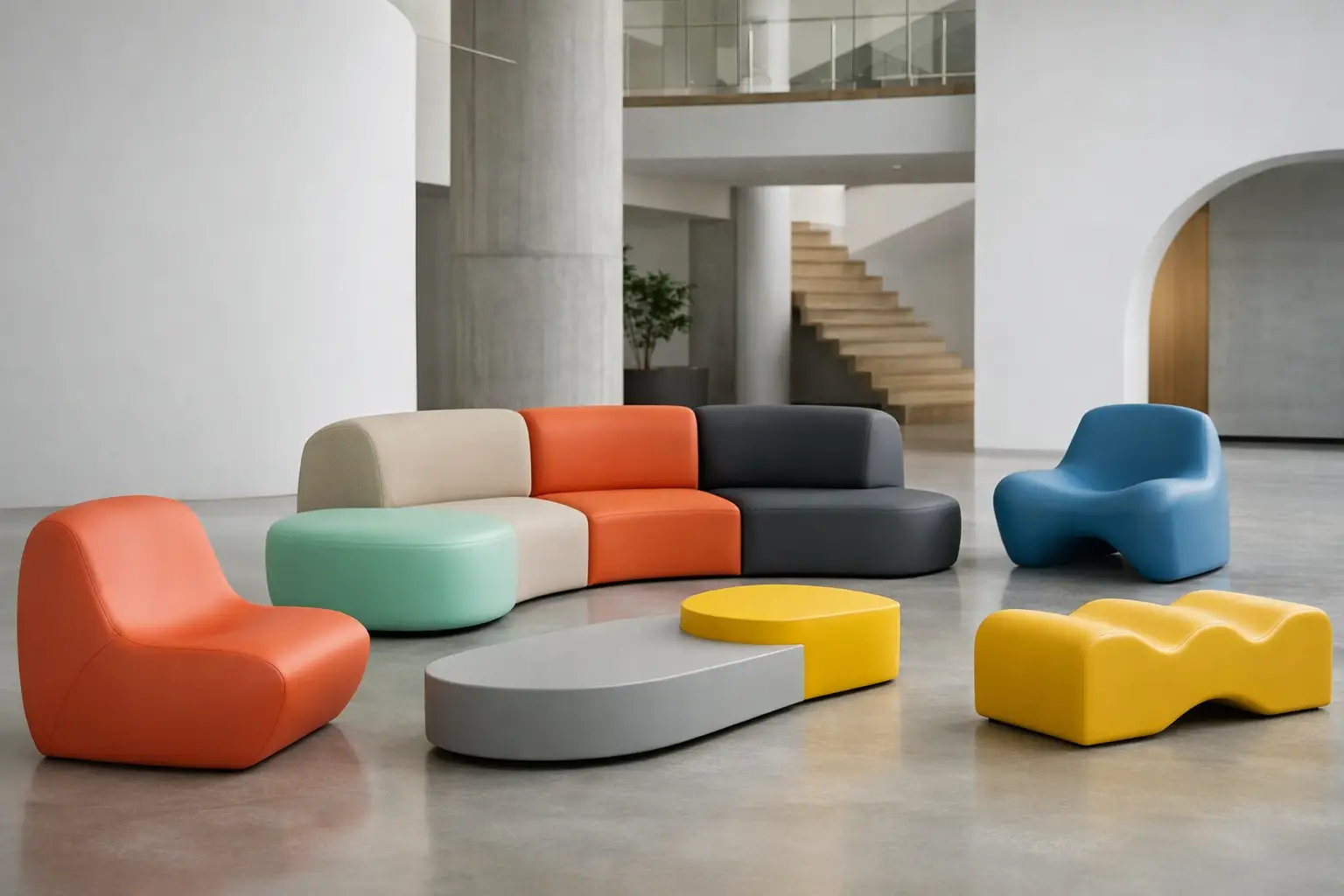
A lobby palette now has to do more than photograph well at opening. It needs to establish a brand, guide movement, withstand constant contact, and remain credible after the initial launch moment has passed. The strongest commercial furniture color trends 2026 respond to that reality with color systems that feel intentional rather than merely fashionable: grounded base tones, purposeful saturation, and finishes selected for how they will perform in public use.
For architects, interior designers, and specifiers, the opportunity is not to chase a single color of the year. It is to use color as part of the spatial concept – on a sculptural bench, a long modular sofa, a series of outdoor planters, or a custom reception element that becomes the project’s visual signature.
Commercial furniture color trends 2026: depth over decoration
The defining shift for 2026 is toward colors with visual weight. Clean white-and-gray commercial interiors are giving way to warmer, more dimensional settings, but this does not mean every project will become intensely colorful. In many successful schemes, saturation is concentrated where it can do the most work: seating islands, social zones, wayfinding landmarks, and branded touchpoints.
Color is being specified as architecture. A low, expansive lounge piece in a dense earth tone can anchor an open hospitality floor plan. A bold cluster of poufs can signal an informal collaboration zone without adding partitions. In retail and experiential spaces, a single unexpected color can create the moment visitors remember and share.
The practical lesson is simple: select colors by their role in the composition. Background colors should support volume, light, and material texture. Accent colors should identify function or create emotional charge. When every item asks for attention, even an ambitious interior can lose its clarity.
Earth pigments become more refined
Terracotta, clay, paprika, ochre, moss, olive, and mineral brown continue to influence commercial palettes, though 2026 versions are less rustic and more edited. They are often softened with gray, black, or umber undertones, giving them a sophisticated presence beside concrete, stone, timber, brushed metal, and dark glass.
These tones work particularly well in hospitality lounges, wellness settings, cultural venues, and workplaces designed to feel residential without becoming domestic. Their strength is longevity. A well-chosen clay red or muted olive carries personality, but it is less likely to feel dated than a highly specific novelty shade.
Warm earth tones also make large upholstered or foam-coated forms feel more grounded. This matters when furniture has a generous silhouette, an exaggerated curve, or a monolithic profile. Color can either emphasize that scale or make it feel heavy. Mid-to-dark mineral tones tend to give sculptural pieces definition without visual noise.
Blue moves toward ink, mineral, and electric notes
Blue remains commercially useful because it can read as calm, technical, premium, or energetic depending on its value and saturation. For 2026, pale corporate blue is giving way to more deliberate choices: inky navy, petroleum, deep teal, storm blue, and mineral blue for foundational pieces. These colors bring depth to workplaces, airport lounges, education settings, and public interiors where durability and visual order matter.
At the other end of the scale, electric blue is emerging as a high-impact accent. It is most effective in controlled doses – a rounded seat, a reception perch, a planter, or a sequence of wayfinding elements. Used across an entire furniture program, it can quickly dominate both the space and the maintenance conversation.
The trade-off is lighting. Deep blues can appear almost black in low-light interiors, while vivid blues may shift dramatically under cool LEDs. Sample review should happen under the project’s actual lighting conditions, not only under showroom light or on a screen.
Optimism is concentrated, not spread everywhere
After years of restrained commercial palettes, designers are reintroducing optimistic color with more discipline. Acid yellow, citrus, coral, signal orange, cobalt, and bright green are returning as moments of energy rather than all-over finishes. The result feels more graphic and more adaptable.
This approach has clear functional value. Saturated seating can draw people toward communal areas in a large workplace. Bright landscape furniture can make a plaza feel active from a distance. In a retail environment, color blocks can distinguish services, launches, or product stories without permanent construction.
For branded environments, the best accent is not always the exact corporate color. Brand guidelines may produce a shade that is too intense for a large upholstered object or too sensitive to variations in light. A neighboring hue, a darker value, or a more material-appropriate interpretation can preserve recognition while creating a more inhabitable interior.
Neutrals are warmer, darker, and more tactile
Neutral does not mean blank. The most versatile commercial neutral palettes for 2026 include chalk, mushroom, putty, warm taupe, tobacco, charcoal, and soft black. These tones create a calm framework for expressive architecture and distinctive furniture while offering greater depth than standard beige or cool gray.
Dark neutrals are especially relevant for high-contact applications. Charcoal and tobacco can be forgiving in lounges, transit-adjacent settings, and outdoor public spaces where daily use is visible. Yet durability should not be reduced to hiding dirt. A darker finish may mask minor marks, but the coating, texture, cleaning protocol, and edge detailing determine long-term appearance.
Lighter neutrals have a different value. They amplify daylight, make compact spaces feel more open, and allow colorful furniture to become a focal point. Their success depends on the project’s maintenance capacity and traffic pattern. A pale lounge seat in a boutique hotel may be entirely appropriate; the same specification at a busy student commons may demand a more considered finish and cleaning strategy.
Tonal zoning replaces random color blocking
Commercial interiors are increasingly designed as a sequence of experiences rather than a collection of rooms. Color helps organize that sequence. Instead of assigning unrelated colors to every area, designers are building tonal families: perhaps warm neutrals in arrival zones, deeper greens and browns in retreat spaces, and one vivid accent for gathering areas.
This is particularly effective in flexible floor plans. A shared workplace can use tonal shifts to distinguish focused work, informal meetings, and social areas without adding visual clutter. A hotel can transition from a bright entry to a darker, more intimate lounge through changes in upholstery, seating color, planters, and architectural surfaces.
Furniture is central to this strategy because it is movable, tactile, and close to the user. Large custom pieces can create a color field that defines a zone immediately. Smaller elements can repeat that field throughout a project, giving a complex plan a coherent visual rhythm.
How to specify color for real commercial use
A strong palette begins with concept, but it must survive procurement, installation, and operation. Color decisions should be reviewed alongside form, finish, location, and expected use. A perfect digital rendering cannot show how a matte surface reacts to fingerprints, how a saturated hue reads against a textured floor, or how a curved object catches light at different angles.
For design-led projects, physical samples are essential. Compare them with the intended flooring, wall finish, metalwork, and lighting temperature. Review both small swatches and larger mockups where possible, since color perception changes significantly across a broad curved surface.
When specifying custom furniture, ask early whether the selected color is intended to disappear into the architecture, support a material palette, or become the project’s icon. Each objective leads to different decisions about saturation, sheen, texture, and scale. A color that works beautifully on a compact pouf may feel overpowering on a five-meter bench.
Coated foam fabrication opens another dimension of control because color can reinforce form rather than simply cover it. On rounded, continuous furniture, a matte coating can make the silhouette feel architectural and monolithic. A brighter finish can turn the same geometry into a playful landmark. Sixinch applies this freedom to permanent collections and bespoke pieces, enabling designers to bring a precise palette and unconventional form into the same production conversation.
The most future-ready palettes allow for change
The best commercial color schemes are not timid, but they are strategic. They place enduring tones on the largest, most expensive, or least replaceable pieces, then use more expressive colors where refreshes are realistic. This might mean a tobacco-toned banquette with bright movable stools, or dark landscape seating punctuated by vivid planters.
That balance protects the project from trend fatigue without flattening its personality. It also gives operators room to evolve programming, seasonal styling, or brand campaigns over time.
For 2026, the most compelling commercial interiors will not be defined by one fashionable shade. They will be remembered for color used with conviction: calibrated to the space, built for contact, and applied to forms bold enough to make that choice visible.